Loading...
Searching...
No Matches
morph::ui::ButtonWidget Class Referenceabstract
A push button. More...
#include <backend.hpp>
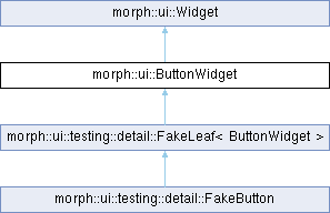
Inheritance diagram for morph::ui::ButtonWidget:
Public Member Functions | |
| virtual void | setLabel (std::string_view label)=0 |
| Replaces the caption. | |
| virtual void | setOnClick (Action onClick)=0 |
| Sets what activation calls (Enter, Space or a click). | |
| virtual void | setEmphasis (ButtonEmphasis emphasis)=0 |
| Sets how much the button stands out. The mount calls it only for another value than Normal. | |
| virtual void | setIcon (std::string_view icon)=0 |
| Sets the icon drawn beside the caption; called once, and only for a button that has one. | |
| virtual void | setStyle (ButtonStyle style)=0 |
| Sets how the button is drawn. A new button is a push button; the mount calls it once, only for Item. | |
| virtual void | setSelected (bool selected)=0 |
| Marks a list entry as the current one, or clears the mark. A new button is not selected; the mount calls it only for an Item, when bound or true. | |
| Public Member Functions inherited from morph::ui::Widget | |
| Widget (Widget const &)=delete | |
| Widget & | operator= (Widget const &)=delete |
| Widget (Widget &&)=delete | |
| Widget & | operator= (Widget &&)=delete |
| virtual void | setVisible (bool visible)=0 |
| Shows or hides the widget and everything inside it. | |
| virtual void | setEnabled (bool enabled)=0 |
| Enables or disables input on the widget and everything inside it. | |
| virtual void | setLayout (LayoutHints const &hints)=0 |
| Sets the size request. | |
| virtual void | setDragKey (std::optional< Key > const &key)=0 |
Makes the widget draggable, carrying key, or not draggable. | |
| virtual void | setDropHandler (std::function< bool(Key const &)> accepts, std::function< void(Key)> onDrop)=0 |
| Makes the widget a drop target. | |
| virtual void | setAccessibleName (std::string_view name)=0 |
| Sets the name assistive technology reads for the widget. | |
| virtual void | setAccessibleRole (std::string_view role)=0 |
| Sets the role assistive technology announces for the widget. | |
| virtual void | setTestId (std::string_view testId)=0 |
| Sets the stable identifier an automated test finds the widget by. | |
| virtual void | setTooltip (std::string_view text)=0 |
| Sets the text shown while the pointer rests on the widget. | |
| virtual void | setSurface (std::string_view surface)=0 |
| Styles the widget and everything inside it with a named token set of the theme. | |
| virtual void | setKeys (std::vector< std::string > const &chords, std::function< void(std::string)> onChord)=0 |
| Declares the keyboard chords the widget handles while focus is inside it. | |
| virtual void | focus ()=0 |
| Moves keyboard focus to the widget. | |
| virtual void | setOnHover (std::function< void()> onHover) |
Calls onHover each time the pointer comes to rest over the widget. A backend without a pointer, or one that does not report hovering, keeps the default, which never calls it: hovering is a hint, such as a prefetch, never something a widget relies on. | |
Detailed Description
A push button.
Definition at line 149 of file backend.hpp.
Member Function Documentation
◆ setLabel()
|
pure virtual |
Replaces the caption.
- Parameters
-
label The caption, UTF-8.
Implemented in morph::ui::testing::detail::FakeButton.
◆ setOnClick()
|
pure virtual |
Sets what activation calls (Enter, Space or a click).
- Parameters
-
onClick The handler; empty does nothing.
Implemented in morph::ui::testing::detail::FakeButton.
◆ setEmphasis()
|
pure virtual |
Sets how much the button stands out. The mount calls it only for another value than Normal.
- Parameters
-
emphasis The emphasis.
Implemented in morph::ui::testing::detail::FakeButton.
◆ setIcon()
|
pure virtual |
Sets the icon drawn beside the caption; called once, and only for a button that has one.
- Parameters
-
icon The name of an icon in the theme's icon set.
Implemented in morph::ui::testing::detail::FakeButton.
◆ setStyle()
|
pure virtual |
Sets how the button is drawn. A new button is a push button; the mount calls it once, only for Item.
- Parameters
-
style The style.
Implemented in morph::ui::testing::detail::FakeButton.
◆ setSelected()
|
pure virtual |
Marks a list entry as the current one, or clears the mark. A new button is not selected; the mount calls it only for an Item, when bound or true.
- Parameters
-
selected Whether it is the current one.
Implemented in morph::ui::testing::detail::FakeButton.
The documentation for this class was generated from the following file:
- morph/ui/backend.hpp